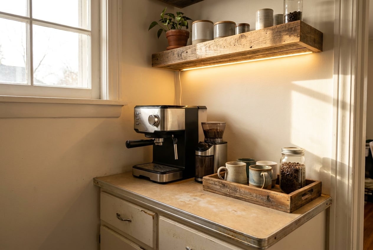
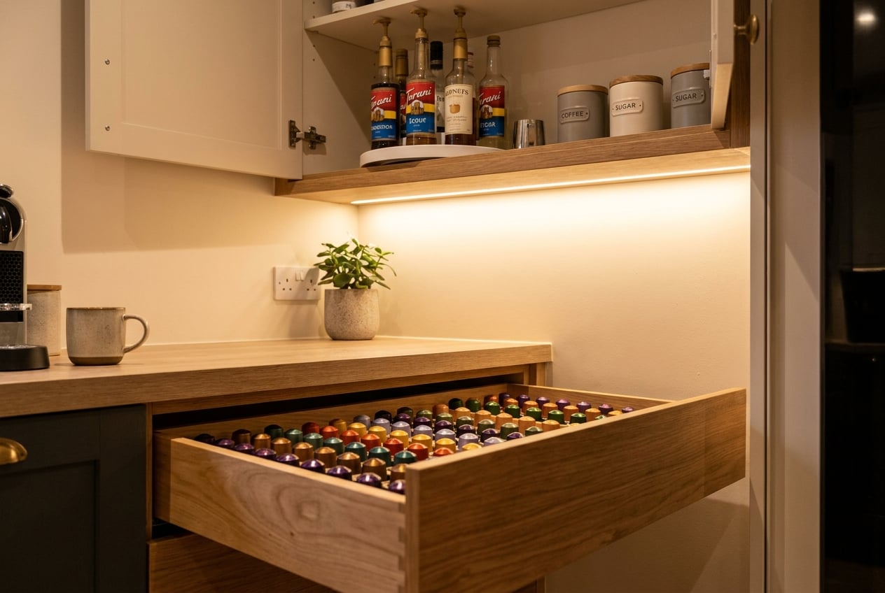
Farmhouse Coffee Bar: 12 Ideas That Read Curated
Twelve farmhouse coffee bar ideas that land curated instead of clearance-aisle: shiplap restraint, bread-board backdrops, black hardware, and one real antique.
Skip to the goods in this piece (6) ↓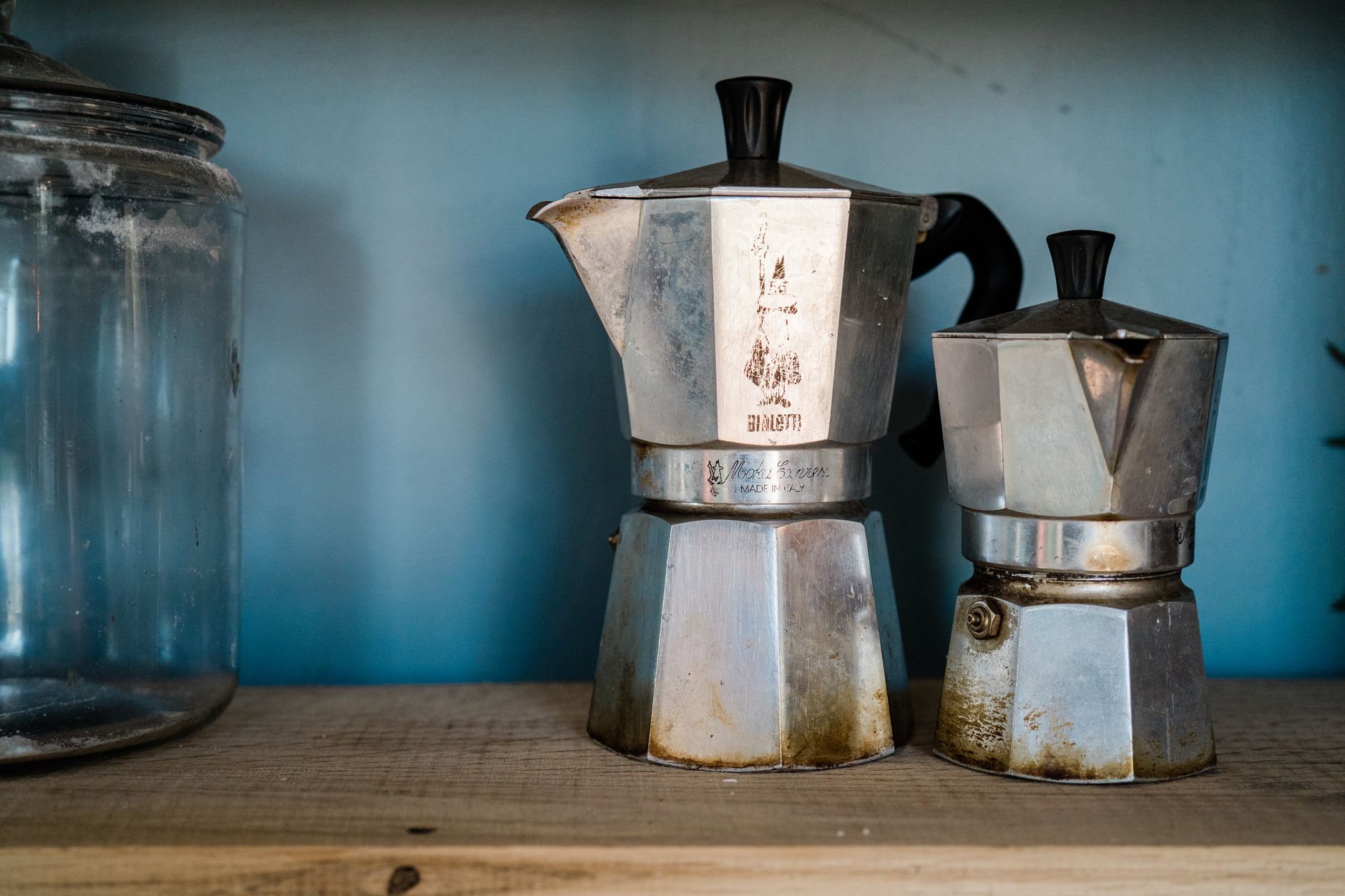
The farmhouse coffee bar is the most copied style in the category and the easiest to get wrong, because the failure mode is subtle — one wrong object and a good setup reads as a craft-store endcap. The difference between curated and clearance is almost never budget. It is edit discipline, and twelve specific decisions.
1. Pick one wood tone and stay there
The single most common tell is four different woods in one frame: a gray-washed shelf, a honey-oak cutting board, a dark walnut tray, and a whitewashed crate. Real old kitchens accumulated wood slowly and it was mostly the same wood.
Choose a lane — warm oak and pine, or weathered gray-brown — and let everything wooden sit within about two shades of it. Mixing one deliberate outlier is fine; mixing four is what makes a station look assembled from clearance bins on different trips.
The lane is usually already chosen by whatever is largest and hardest to change. If the floor is honey oak, go warm and stop fighting it. If the cabinets are gray-washed, the boards and trays should be too. Raw wood that has never been stained is the easiest thing to bring into line, since it will drift toward whatever it sits next to after a season of kitchen light.
2. Shiplap, if at all, on one plane
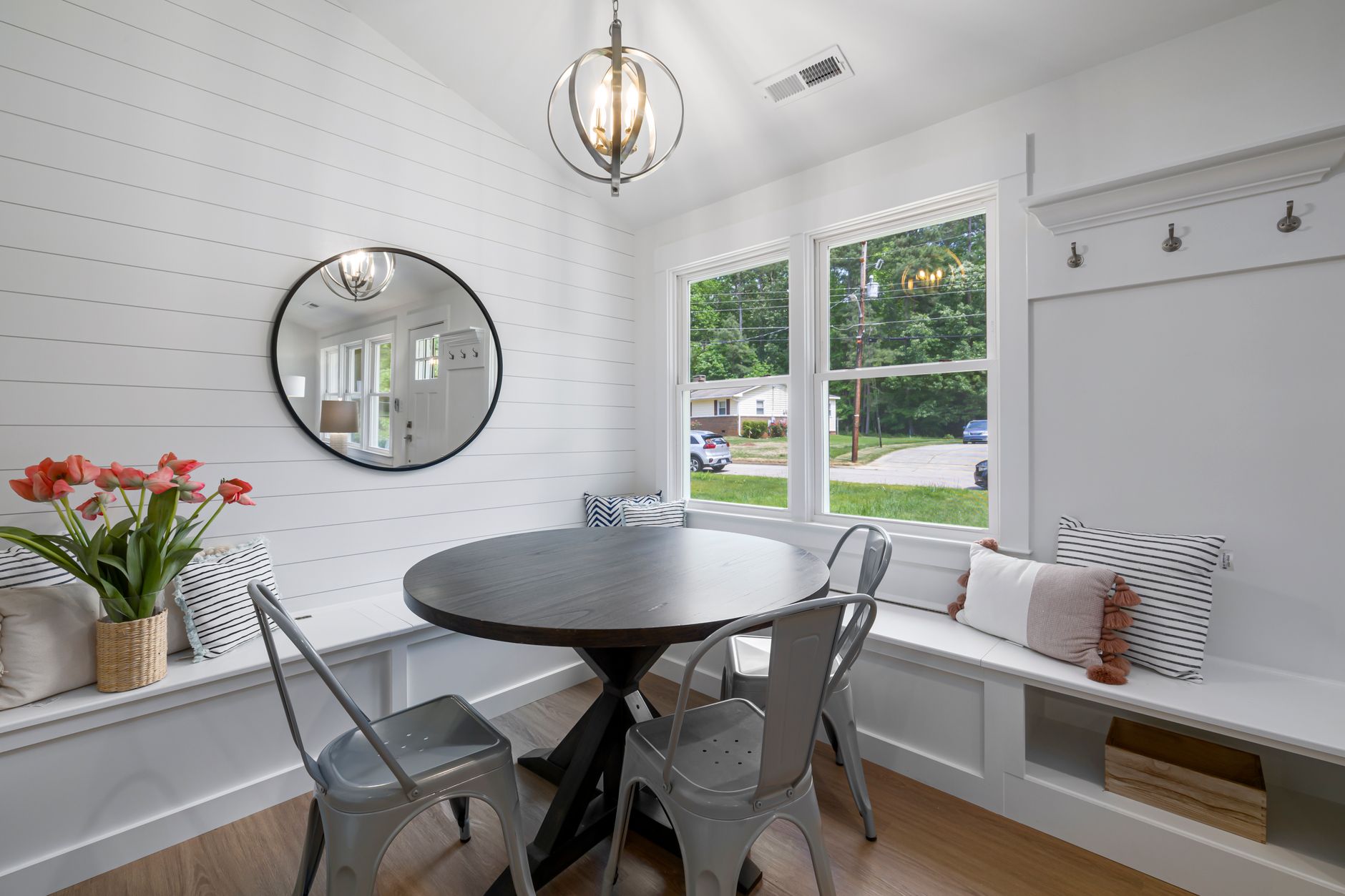
Shiplap is not required for a farmhouse coffee station, and the setups that skip it often look better. When it is used, it works on exactly one plane: the wall directly behind the station, stopping at the edges of the counter or the cabinet run rather than wrapping.
Narrower boards read older. Wide, deeply grooved panels read like a 2016 renovation. If the plan is a peel-and-stick or panel version, keep the reveal — the gap between boards — tight, because oversized gaps are the detail that gives a fake install away from ten feet.
3. Black hardware is the contrast line
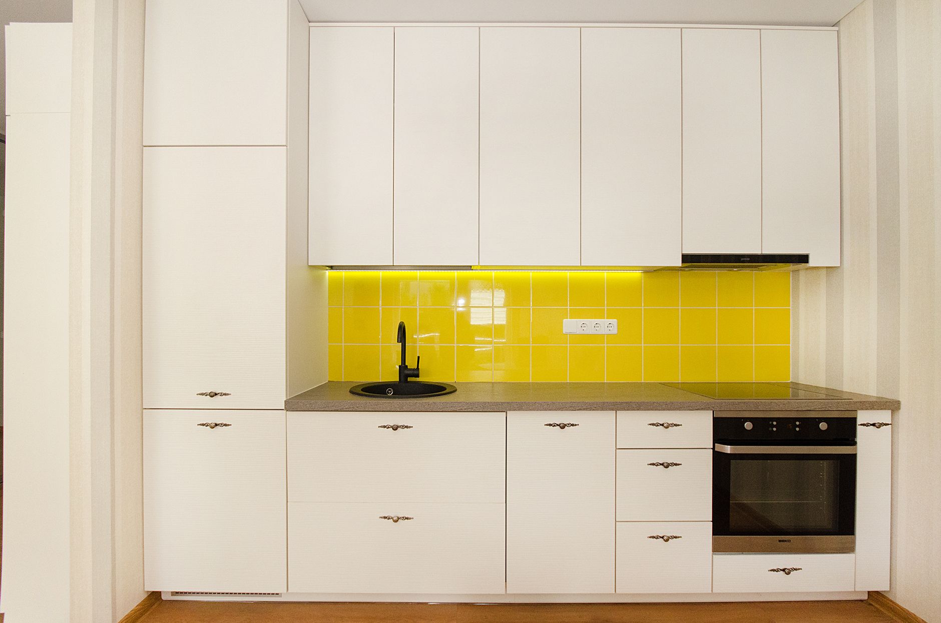
Every good farmhouse kitchen has a dark line running through it: cabinet pulls, a faucet, window muntins, the frame of a shelf bracket. Without that line the palette turns to beige on cream on white and the whole thing goes soft.
Matte black, and only matte black. The trouble starts when oil-rubbed bronze from one era meets satin nickel from another meets matte black from the current one, all within three feet. Swapping to matte black pulls on the cabinets flanking the station is a screwdriver job and changes the read of the whole corner. Match the shelf brackets to them if the brackets are visible.
4. Bread boards are the backdrop
A wooden bread board leaned against the backsplash does what a framed sign is trying to do, and does it without words. Three of them in graduated sizes, overlapping slightly, leaning rather than hung, angled so the handles read as a line.
The ones worth using have wear — knife scoring, a darkened rim, a handle worn thin on one side. Boards with a factory-distressed finish and a perfectly uniform edge look exactly like what they are. Antique-store boards and secondhand kitchenware are cheap in most markets and the difference is visible immediately.
5. Mason jars, minus the vinyl
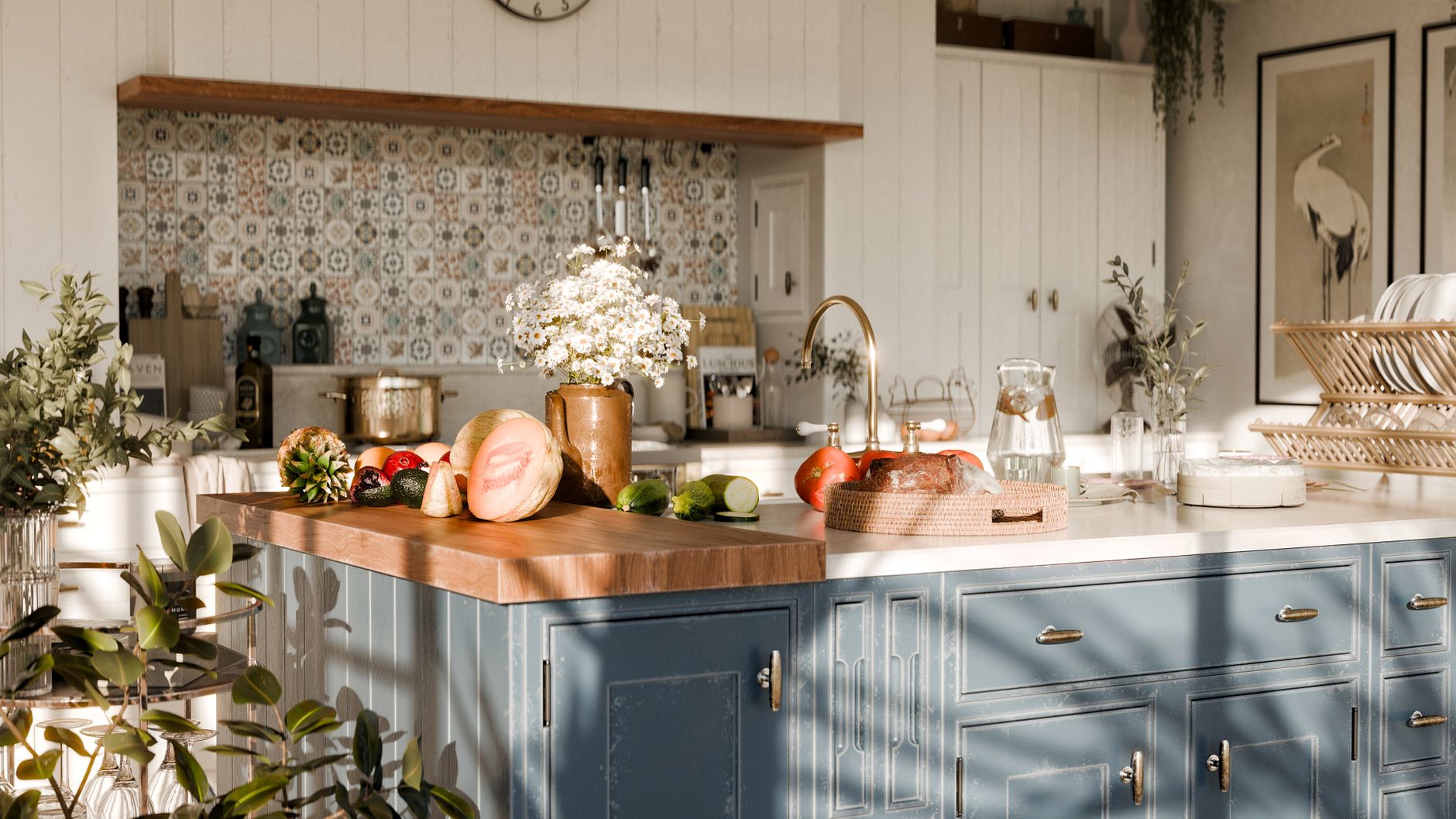
There is nothing wrong with a glass jar of beans. There is a great deal wrong with a glass jar of beans wearing a vinyl decal that says COFFEE in a script font, next to one that says SUGAR, next to a chalkboard tag on a length of jute twine.
Rules that keep jars on the right side of the line: clear glass, matched lids, no labels at all or small handwritten paper tags. Fill them properly — a jar at forty percent looks like a jar of leftovers. And limit the count to three or four, grouped, rather than a row of eight. A matched glass canister set beats assorted salvaged jars unless the salvaged jars genuinely match, which they rarely do.
6. Use a vintage scale as a riser
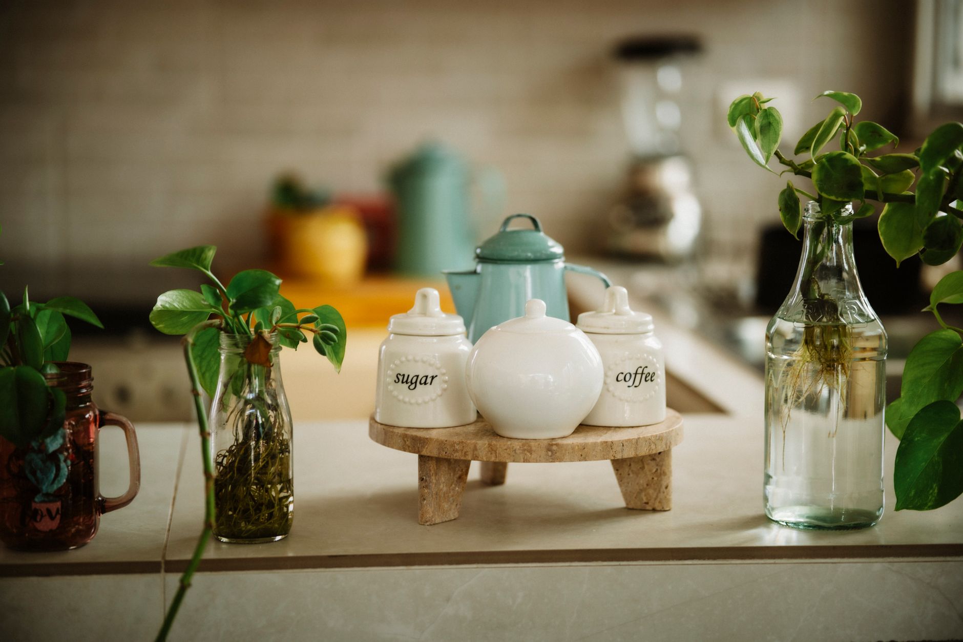
Flat arrangements read flat. A cast-metal kitchen scale, a stack of two books, or an inverted crate gives the arrangement a second height and a place to set a small plant or a pair of mugs.
The scale is the version that carries the most weight, literally and stylistically. It is functional-looking, it is period-correct, and it does not announce itself as decor. Anything sold specifically as a riser generally does.
Height variation is the mechanic underneath the trick, and it is worth stating plainly: three objects at three different heights, roughly a hand’s width apart, will always photograph better than five objects at the same height in a line. Put the tallest at the back or the side, never dead center. Enamel canisters, a small crate turned on its end, and a stack of two cookbooks all work when a scale is not available.
7. One genuinely old object
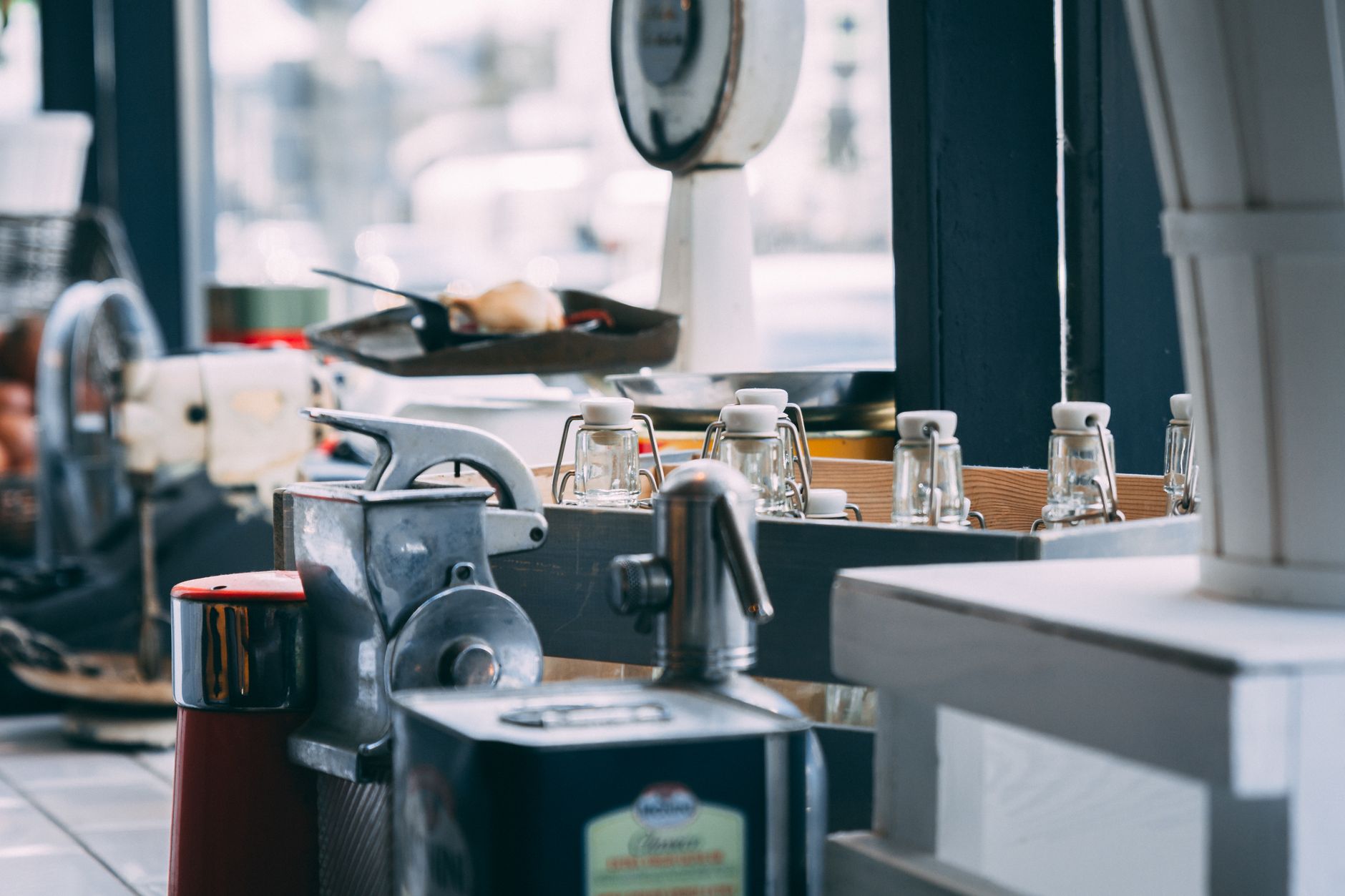
This is the rule that separates the two categories more reliably than any other. A single real antique — a scale, an enamel pitcher, a wooden dough bowl, a mercantile tin with the paint actually worn off it — anchors everything around it, and the reproductions nearby borrow credibility from it.
Reverse the ratio and it collapses. Ten reproductions and zero real pieces produce a station where every object was manufactured to look old in the same year, in the same factory finish, and the eye picks that up before the brain does.
8. Ironstone and stoneware, not matched porcelain
Warm off-white with visible weight. Slight color variation between pieces is a feature, since real ironstone was collected over decades and no two pieces match exactly.
A set of six ironstone-style mugs is the easy path; a collected assortment in the same off-white family is the better one, if patience allows. What does not work is a matched twelve-piece modern set in bright optical white, which reads as tableware rather than kitchen.
9. One pattern, repeated
Ticking stripe. Or buffalo check. Or grain-sack stripe. One of them, used two or three times in the room, and no others.
The clearance-aisle look is largely a pattern problem: check on the towel, floral on the sign, gingham on the jar lid, plaid on the runner. A stack of matching ticking stripe towels and nothing else patterned in the frame will look more expensive than four different patterns of anything.
10. A crock for the spoons
Small, practical, and correct for the style. A cream or salt-glaze stoneware crock holding scoops, stirrers, and a spare spoon keeps the counter usable while looking like it has been there thirty years.
What it replaces is the tiered organizer with compartments labeled for each item, which is a fine object in a pantry and the wrong object on a farmhouse counter. The general principle: in this style, storage should look like a container that happens to hold something, not like a product designed to solve a storage problem. A crock, a small basket, a wooden box, a bowl. Anything with molded dividers is working against the whole premise.
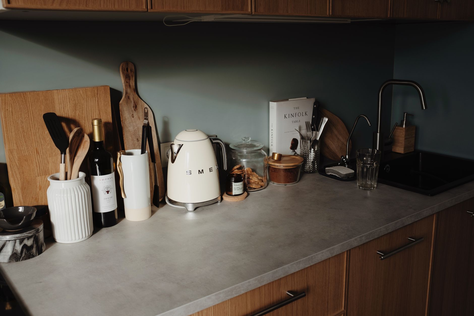
11. Negative space is the actual farmhouse tell
Working farm kitchens were not decorated. They held the tools in use and empty counter around them, because the counter was a work surface and someone was going to need it in an hour.
That is the quality the good photos are reproducing, whether or not they know it: an eighteen-inch stretch of bare wood or stone, doing nothing. Roughly half the visible surface should be empty. Anyone who arranges to that ratio will land in the right place even if every individual object is a reproduction, and anyone who fills every inch will miss it even with a counter full of genuine antiques.
12. The clearance-aisle checklist
Nine things that pull a rustic coffee bar down fastest, in rough order of severity:
- Word signs. “But First, Coffee,” “Gather,” “Blessed,” “Fresh Brewed Daily.” All of them.
- Chalkboard menus with hand-lettered drink lists and prices.
- Galvanized metal on more than one object. It was a real material; it is now a shorthand.
- Chicken wire on cabinet fronts, unless the cabinet is actually old.
- Factory distressing — sanded-through edges in identical spots on every piece.
- Jute twine tied around things that do not need tying.
- Fake rust and fake patina, both of which photograph as paint because they are paint.
- Barn-star anything.
- More than one faux-eucalyptus stem in the frame.
Cut those and a modern farmhouse coffee bar generally fixes itself, because what remains is wood, white, black hardware, glass, and empty counter — which was the whole recipe.
Once the style is settled, the storage question comes next: coffee bar cabinet options covers the freestanding hutches and base cabinets that suit this look, and coffee station organization handles what goes behind the doors. For renters, where hardware swaps and shiplap are both off the table, the apartment coffee bar approach gets most of the way there with nothing permanent — the wood tones, the crock, the ticking stripe, and the empty counter all travel.
Some links in this article are affiliate links — if you buy through them we may earn a commission at no extra cost to you. Details.